Period Tracker apps its most important topic for girls who don’t know when next period date is come. Period Tracker Apps With Clean Design show some simple apps which can help you track your period date.
A quieter relationship with tracking
Most period tracking apps promise clarity.
But clarity is not the same as calm.
Sometimes, the very act of opening an app feels loud.
Too many colors.
Too many questions.
Too much insistence.
A cleanly designed period tracker does something different.
It steps back.
It gives you space to notice your body without commentary.
To log without being guided, nudged, or sold to.
To close the app and return to your day.
This article is about those apps.
The ones that whisper instead of shout.
What “clean design” really means in this space
Clean design is often misunderstood.
It is not about white backgrounds or muted palettes.
It is about emotional load.
Less color, more breathing room
Clean design leaves margins.
It does not crowd the screen with icons asking for attention.
It does not animate every interaction.
You feel it immediately.
Your shoulders drop.
Information without pressure
A clean app gives you facts without judgment.
No celebratory confetti.
No warnings framed as urgency.
No sense that you are “behind.”
Just information.
Waiting quietly.
When an app feels like a notebook, not a dashboard
The best trackers feel analog.
They behave like a notebook kept in a drawer.
Available when needed.
Invisible otherwise.
You open them.
You write something down.
You leave.
No friction.
No performance.
Apps that keep their voice low
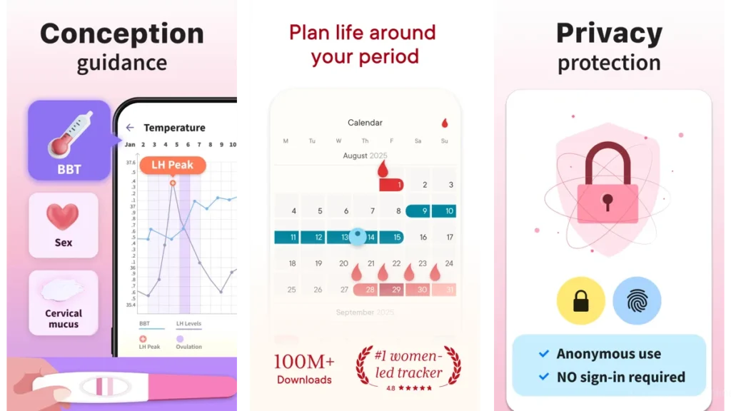
Clue: measured, scientific, calm
Clue feels like a well-lit room.
Everything is intentional.
Nothing competes for attention.
The language is neutral.
The interface respects your intelligence.
Privacy is treated as a foundation, not a feature.
Using Clue feels steady.
Reliable.
Unemotional in the best way.
Period Calendar: familiar and steady
This app feels like something you already understand.
The calendar view is clear.
Logging is quick.
Reminders are discreet.
There is no sense of urgency.
No attempt to educate unless you ask.
It feels like routine.
And routine can be comforting.
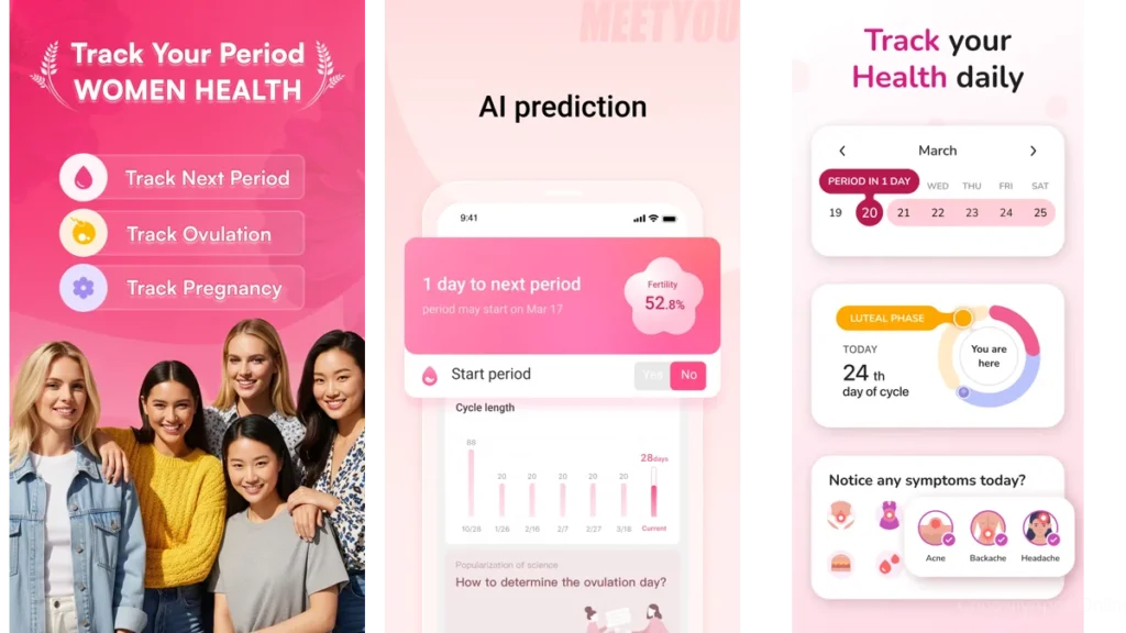
MeetYou: soft edges, personal tone
MeetYou feels handwritten.
Not literally, but emotionally.
There is warmth here.
A sense that the app expects inconsistency.
That life is allowed to be uneven.
It is forgiving.
It does not demand precision.
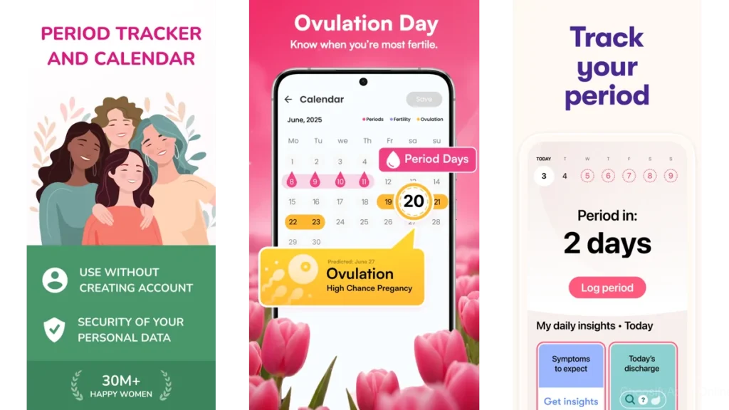
Clover: privacy-first and restrained
Clover does not ask many questions.
It does not require an account.
It does not try to learn more than you offer.
This restraint matters.
It creates trust through absence.
Through what it does not collect.
WomanLog: practical without noise
WomanLog feels functional.
Not cold.
Just focused.
It handles irregular cycles with patience.
It presents data plainly.
No emotional framing.
Just information, laid out clearly.
How these apps feel different in daily life
Opening the app on a tired morning
You are not greeted with color.
Or messages.
Or demands.
You see what you need.
Nothing more.
Logging without emotional labor
Clean apps do not ask how you feel about logging.
They simply let you do it.
This matters more than it sounds.
A simple comparison, in human terms
| App | How it feels | Best for |
| Clue | Calm, measured, thoughtful | Those who value privacy and clarity |
| Period Calendar | Familiar and routine | Those who want reliability |
| MeetYou | Soft and personal | Those who want warmth |
| Clover | Quiet and private | Those who want minimal exposure |
| WomanLog | Practical and steady | Those with irregular cycles |
Which one should you choose
If you want silence
Choose the app that asks the least of you.
The one you forget is there.
If you want gentle structure
Choose familiarity.
Calendars.
Predictable flows.
If you want control without exposure
Privacy-first design matters.
Absence is a feature.
Practical advice for choosing calmly
Install one app.
Not three.
Use it for a full cycle before deciding.
Pay attention to how you feel when opening it.
That feeling is the answer.
Conclusion
A good period tracker disappears.
It does its job.
Then it steps aside.
Clean design is not about beauty.
It is about relief.
About fewer questions.
Fewer decisions.
More room to breathe.
When the noise fades, understanding has space to arrive.
FAQ
Do clean design apps track fewer things?
Often, yes. And that restraint is intentional.
Are minimalist apps less accurate?
No. Accuracy comes from consistency, not complexity.
Is privacy better in simpler apps?
Usually. Fewer features often mean fewer data demands.
Can a clean app still handle irregular cycles?
Yes. Practical design often supports flexibility better.
Should I pay for a premium version?
Only if it adds calm, not pressure.

