Travel planning often begins quietly.
A thought.
A place name.
A feeling that it might be time to go somewhere else.
And then, almost immediately, the noise arrives. Tabs open. Lists multiply. Notifications blink. What began as a gentle idea turns into something busy and demanding.
Not every traveler wants that.
Some of us want tools that feel more like a clear desk than a command center. Apps that help us organize without taking over. Interfaces that don’t rush us or ask for attention they haven’t earned.
This is where minimalist travel planner apps matter.
Not because they are trendy.
But because they offer relief.
A Quiet Beginning: Why Some Travelers Need Less
The fatigue of planning
Planning a trip can feel heavier than the trip itself.
Flights, accommodations, times, confirmations.
Each detail small, yet collectively overwhelming.
When tools mirror that overwhelm, the weight doubles.
Minimal design does something subtle.
It removes friction.
It asks less of you.
When tools add noise instead of clarity
Many travel apps try to do everything at once.
They shout features.
They fill the screen.
Minimal planners choose restraint. They understand that clarity is not created by more information, but by better boundaries.
Minimalism as emotional relief, not style
Minimalism here isn’t about aesthetics.
It’s about breathing room.
Space between elements.
Decisions made easier.
A sense that nothing is urgent unless you decide it is.
What “Minimal” Really Means in a Travel App
Fewer choices, clearer decisions
When an app offers fewer paths, choosing becomes lighter.
Minimal travel planners guide rather than bombard.
They narrow the field without closing it.
Space, margins, and breathing room
White space is not emptiness.
It’s permission.
Permission to pause.
Permission to scan.
Permission to think.
When an app knows when to step back
The best tools disappear when their job is done.
They don’t demand daily check-ins.
They wait patiently until needed.
The Shape of a Calm Travel Planner
One place for everything
Minimal apps succeed when they reduce fragmentation.
One screen.
One flow.
No scavenger hunt across menus.
Information without urgency
Dates exist without alarms.
Reservations sit quietly, ready when you need them.
Nothing blinks.
Planning that feels like arranging a desk, not managing a project
You’re not “optimizing.”
You’re arranging.
Placing things where they belong.
Apps That Stay Quiet While You Plan
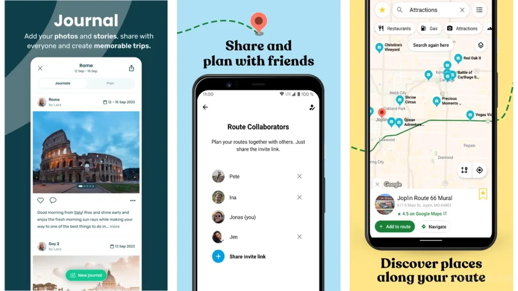
Wanderlog: A Thoughtful Travel Notebook
How it feels to use
Wanderlog feels like a notebook that understands geography.
You add places.
You move them around.
The map adjusts without drama.
There’s no sense of being rushed. Just quiet organization.
Who it gently supports best
Travelers who like seeing their days unfold visually.
People who enjoy arranging rather than scheduling.
When it fades into the background
Once your itinerary is in place, Wanderlog becomes still.
It waits.
TripIt: Letting Automation Do the Heavy Lifting
Trusting the app to collect the pieces
TripIt asks very little.
You forward your confirmations.
It assembles them.
No manual input unless you want it.
The relief of not searching your inbox
That quiet relief is its core feature.
Knowing everything exists somewhere stable.
Ideal travelers for TripIt
Those who value structure.
Those who prefer systems that run quietly in the background.
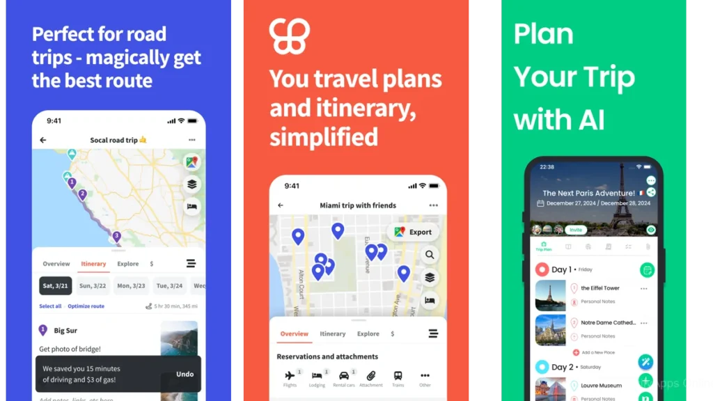
Stippl: Planning With a Sense of Story
Blending logistics with memory
Stippl doesn’t separate planning from remembering.
Your itinerary sits beside moments.
Notes.
Impressions.
A softer approach to itineraries
Days feel less like schedules and more like chapters.
When emotion matters as much as order
This app suits travelers who travel to feel, not just arrive.
Travel Pal: Simple, Direct, and Uncluttered
For travelers who want just enough
Travel Pal doesn’t try to be everything.
It focuses on the essentials.
Nothing more.
Calm visuals, calm decisions
The interface stays out of the way.
You notice your plans, not the app.
Its quiet strengths
Clarity.
Simplicity.
Predictability.
Subtle Differences, Felt Rather Than Measured
Maps versus lists
Some minds think spatially.
Others linearly.
Neither is better.
Only different.
Automation versus intention
TripIt automates.
Wanderlog invites interaction.
Stippl blends.
The process matters as much as the result.
How each app “feels” over time
The right app is the one you forget about until you need it.
A Gentle Comparison at a Glance
| App Style | Best For | Overall Feeling |
|---|---|---|
| Wanderlog | Visual planners | Calm, flexible |
| TripIt | Structured travelers | Reliable, quiet |
| Stippl | Reflective travelers | Warm, narrative |
| Travel Pal | Minimalists | Simple, steady |
This table tells you very little.
Your response to it tells you everything.
Which One Should You Choose?
If your mind is already full
Choose the app that asks the least of you.
Automation can be kindness.
If you love structure
A clear system can feel grounding.
Let it hold the details so you don’t have to.
If travel is about memory, not efficiency
Choose the tool that leaves room for reflection.
Using Travel Apps Without Letting Them Take Over
Set it up, then step away
Planning has an endpoint.
Honor it.
Avoiding constant checking
Your trip exists whether the app is open or not.
Let the trip be larger than the plan
Plans support experiences.
They are not the experience.
When Minimal Apps Work Best Together
Pairing a planner with navigation
One app to plan.
One to move.
That’s often enough.
Knowing when one app is enough
If an app feels complete, trust that feeling.
Conclusion: Choosing Quiet on Purpose
Minimal travel planner apps do not promise better trips.
They promise less noise.
Less mental clutter.
Less urgency.
More space to arrive already calm.
In the end, the best tool is the one that steps aside.
FAQ
Are minimalist travel apps missing important features?
Usually not. They simply hide complexity until it’s needed.
Can I plan complex trips with a simple app?
Yes. Complexity doesn’t require clutter.
Do minimalist apps work offline?
Many do. Quiet tools understand unreliable connections.
Are these apps better for solo travelers or groups?
Both. Calm scales well.
How do I avoid over-planning with any travel app?
Stop when clarity appears. That’s enough.