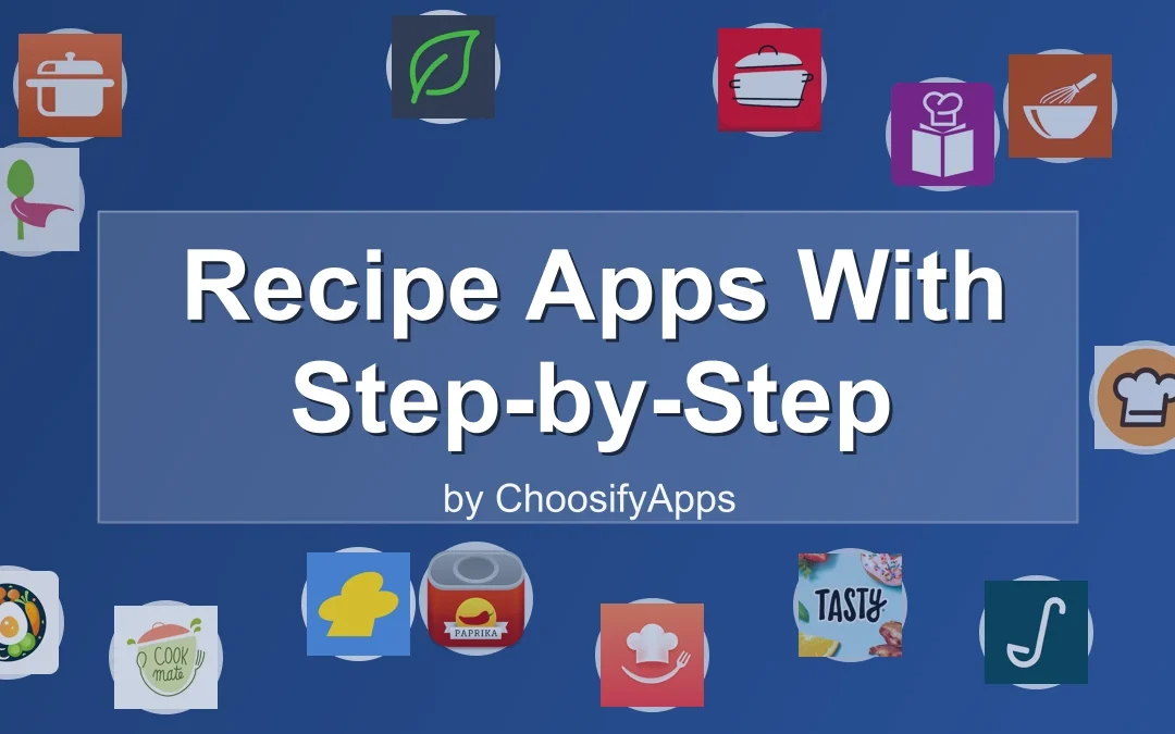
Today Aricle for those peoples who loved cooking and find best Recipe Apps With Step-by-Step Minimal Design. In this article i will show you some playstore apps where you can find best recipes.
Recipe Apps With Step-by-Step Minimal Design
The kitchen is quiet.
Not silent.
Just quiet enough.
You open your phone, not to scroll, not to decide, but to begin.
Cooking used to feel like this.
Before notifications.
Before five pop-ups asking what you want to cook tonight.
Some recipe apps still remember that feeling.
They don’t rush you.
They don’t shout.
They move one step at a time.
This is about those apps.
A Quiet Moment Before Cooking Begins
The weight of too many tabs
Most recipe apps try to help by offering everything.
Endless photos.
Infinite substitutions.
Crowdsourced opinions stacked on top of each other.
By the time you reach step one, you’re already tired.
Minimal design isn’t about aesthetics.
It’s about removing the moment where you almost close the app.
When recipes feel louder than the kitchen
Cooking should meet you where you are.
Sometimes that place is confident.
Often it’s distracted.
Sometimes it’s just hungry.
Step-by-step minimal apps understand this.
They wait.
What “Minimal” Really Means in a Recipe App
Fewer choices, clearer movement
Minimal does not mean empty.
It means deliberate.
One step fills the screen.
The next waits quietly underneath.
Nothing flashes.
Nothing competes.
Step-by-step as emotional guidance, not instruction
A good step doesn’t just tell you what to do.
It tells you where to stand.
Chop this.
Pause.
Heat the pan.
You are not behind.
Calm design as cognitive relief
When the screen is calm, your hands move more confidently.
You don’t reread.
You don’t second-guess.
You cook.
Why Step-by-Step Matters More Than Ever
Cooking while tired
Most cooking happens after something else.
After work.
After noise.
After decisions.
Step-by-step design respects that.
Holding attention without demanding it
The best apps don’t ask for focus.
They receive it.
One action at a time
This is the quiet promise:
You only need to do this next thing.
Kitchen Stories — When the App Feels Like a Quiet Teacher
Kitchen Stories moves like a calm voice over your shoulder.
Visual steps that breathe
Each step arrives with space.
Photos are supportive, not decorative.
Text is clear, never dense.
You don’t scroll much.
You advance.
Cooking mode as a closed door
Cooking mode removes everything unnecessary.
No wandering.
No accidental taps.
Just the recipe.
Who this app is for
If you want to be gently guided.
If visuals help you trust yourself.
If you like feeling taught, not tested.
Paprika Recipe Manager — A Personal, Silent Cookbook
Paprika doesn’t try to inspire you.
It tries to stay out of your way.
Your recipes, your order
This app is about containment.
You bring the recipes.
You decide the steps.
Everything sits where you left it.
No discovery pressure
No trending dishes.
No suggestions.
Just your food.
Who this app is for
If you already know what you like.
If you want structure without influence.
If control feels calming.
SuperCook — Starting From What’s Already There
SuperCook begins with a relief.
You don’t need more ingredients.
Relief through constraint
By limiting what’s possible, the app creates calm.
No browsing fantasies.
Only what’s real.
Step clarity varies, intention does not
Steps depend on the source recipe, but the entry point is always gentle.
Who this app is for
If decision fatigue starts at the grocery store.
If you want permission to make do.
BBC Good Food — Familiar, Steady, Unrushed
This app feels like a well-used cookbook.
Trust as a design feature
The tone is measured.
Instructions don’t assume expertise.
They explain without condescension.
Step instructions that don’t assume confidence
Nothing feels rushed.
Who this app is for
If reassurance matters.
If you like knowing someone has cooked this before.
Cookpad — Human Steps, Shared Quietly
Cookpad feels lived-in.
Community without performance
These are real kitchens.
Steps sometimes include small notes.
Little pauses.
Imperfect, human pacing
Not everything is optimized.
That’s the point.
Who this app is for
If you like human warmth.
If imperfection feels grounding.
Newer AI-Driven Recipe Apps — Calm Potential, Uneven Execution
These apps often look quiet.
Sometimes they are.
Clean screens, mixed depth
Design is minimal.
Steps can feel generic.
When simplicity still needs seasoning
Calm design needs thoughtful instruction.
Not just generated text.
Comparing the Experience, Not the Specs
| App Style | How It Feels | Best For |
| Guided visual | Like a calm teacher | Learning with reassurance |
| Personal manager | Like a notebook | Control and routine |
| Pantry-first | Like opening the fridge | Decision relief |
Which One Should You Choose?
If you want guidance
Choose something that walks with you.
If you want control
Choose something that listens.
If you want reassurance
Choose something familiar.
You’ll know within minutes.
Your shoulders will drop.
Practical Advice for Choosing a Calm Recipe App

Notice how your body responds
Do you breathe easier?
Or lean closer?
Fewer features, fewer decisions
Complexity is not depth.
Calm is the metric
If the app disappears, it’s working.
When Technology Steps Aside
The moment you stop looking at your phone
This is the goal.
The recipe disappears, dinner remains
Technology did its job.
Conclusion
Minimal recipe apps are not about doing more.
They are about removing friction.
About space on the counter.
Silence between steps.
A sense that nothing else is required of you.
Cooking becomes smaller.
And somehow, kinder.
FAQ
Are minimalist recipe apps good for beginners?
Yes. Clear steps reduce anxiety and build confidence.
Do step-by-step apps slow cooking down?
They often make it smoother, not slower.
Can minimal apps handle complex recipes?
Yes, when complexity is broken into calm steps.
What if I get bored with simple designs?
Boredom can be a sign of mental rest.
Is paid worth it for calm design?
Sometimes. Relief is often the feature you’re paying for.