The phone wakes before we do.
It lights up the room.
It waits.
And before any message, before any task, before the day even finds its shape, we meet the home screen.
For many of us, that first glance is crowded.
Too many colors.
Too many shapes asking for attention.
Noise before thought.
A clean home screen is not about style.
It is about relief.
It is the quiet desk before work begins.
The clear table before a meal.
The empty room where you can finally hear yourself think.
Some apps shout.
These do not.
A Quiet Place on Your Device

Why icons matter more than we think
Icons are small.
We rarely notice them individually.
But together, they create atmosphere.
Sharp colors increase urgency.
Heavy shapes pull the eye.
Inconsistent styles keep the mind scanning, never settling.
A clean icon pack removes friction you did not realize you were carrying.
Your eyes stop darting.
Your thumb moves without hesitation.
There is less to manage.
Less to interpret.
Just space.
Not decoration — silence between elements
Minimal icon packs are often mistaken for aesthetic trends.
They are not.
They are pauses.
They create silence between functions, allowing the tool to step aside after it has done its job.
Minimalism here is not absence.
It is restraint.
Understanding What a Clean Home Screen Feels Like
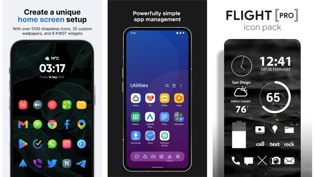
Calm through visual breathing room
A clean home screen does not demand efficiency.
It offers permission.
Permission to open one thing at a time.
Permission to not see everything at once.
Permission to breathe.
Spacing matters more than features.
Consistency matters more than detail.
When icons share a visual language, your mind rests.
The psychology of visual simplicity
Our brains are pattern-seeking.
When patterns align, energy is conserved.
Minimal icon packs reduce decision fatigue in small, cumulative ways.
You may not notice it immediately.
But by the end of the day, you feel it.
The Core Choices: Icon Packs That Feel Gentle
Letters — a restrained beginning
Letters uses form without flourish.
Clean shapes.
Soft geometry.
The icons feel like labels on well-organized drawers.
They do not compete with each other.
They simply exist.
This pack suits those who want their phone to fade slightly into the background of their life.
Flight Lite — light as breath
Flight Lite is airy.
Almost weightless.
White icons on quiet backgrounds feel like sunlight on paper.
There is no drama here.
Only openness.
It works best when paired with muted wallpapers and minimal widgets.
Let it float.
Lines — whisper-thin outlines
Lines removes mass entirely.
What remains is outline.
The icons are present, but barely.
Like pencil sketches left intentionally unfinished.
For dark-mode users, Lines creates a sense of depth without heaviness.
The screen feels less like a wall.
More like a window.
Expressive Yet Still Calm
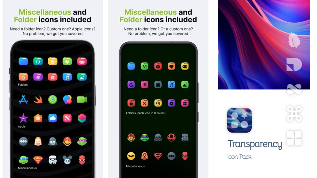
Verticons — vertical harmony
Verticons introduces structure without noise.
The vertical orientation subtly encourages order.
Rows feel intentional.
Spacing feels deliberate.
It is a gentle guide, not a rulebook.
Circons — circular consistency
Circons relies on rhythm.
Circles repeat.
The eye relaxes.
Nothing stands out too much.
Nothing disappears entirely.
This is balance for those who want calm without starkness.
Pure Essence Black — quiet contrast
Contrast can still be calm.
Pure Essence Black uses bold outlines with restraint.
The icons feel grounded, like ink on clean paper.
It suits users who want clarity without color overload.
Minma — warmth without clutter
Minma introduces softness.
Muted tones.
Gentle curves.
It is minimalism with a human touch.
Ideal for those who find pure monochrome too severe.
Tools for Personalization
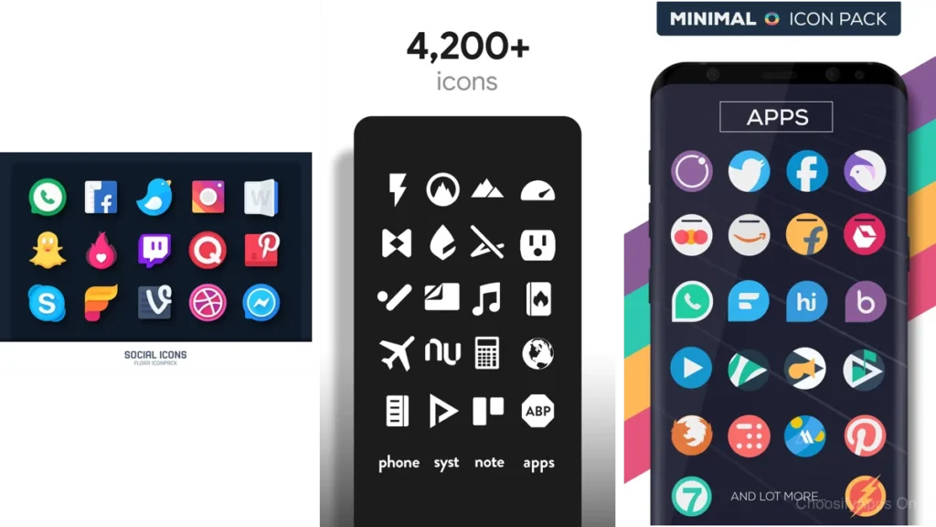
Icon Pack Studio — crafting your own calm
Some people need choice.
Icon Pack Studio is less about consuming a style and more about shaping one.
You decide the weight.
The shape.
The silence.
It takes time.
But the result feels personal in a way pre-made packs cannot.
When control becomes comfort
Customization is not about perfection.
It is about ownership.
When your screen reflects your rhythm, you stop adjusting.
You simply use it.
A Simple Comparison
| Style | Feels Like | Best For |
| Letters / Lines | Quiet shelves | Extreme minimalism |
| Flight Lite / Circons | Open air | Visual lightness |
| Minma / Verticons | Soft structure | Balanced calm |
Which One Should You Choose?
If you crave silence, choose Lines or Letters.
If you want lightness, choose Flight Lite.
If you need warmth, choose Minma.
If you want control, choose Icon Pack Studio.
There is no best choice.
Only the one that makes you pause when you unlock your phone.
That pause matters.
How to Apply These Icon Packs with Quiet Precision
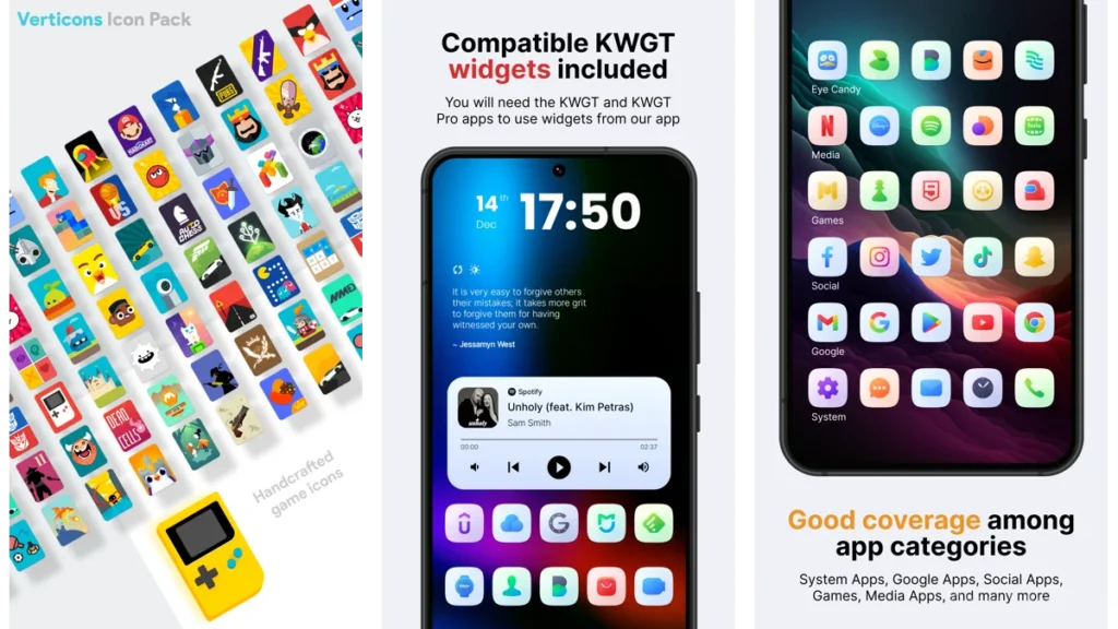
Choose a simple launcher
A clean icon pack needs room.
Minimal launchers work best.
Avoid unnecessary animations.
Let transitions be gentle.
Reduce before you rearrange
Remove apps you rarely open.
Folders are helpful, but restraint is better.
The goal is not symmetry.
It is ease.
Pair with calm wallpapers
Soft gradients.
Neutral textures.
Subtle light.
Your wallpaper should support the icons, not compete with them.
Gentle Optimization Tips
Less color, more space
Color draws attention.
Use it sparingly.
Keep one screen if possible
Multiple screens invite clutter.
One screen encourages intention.
Let icons fade into the background
Your phone is a tool.
It should step aside when not needed.
Conclusion: A Screen That Lets You Breathe
A clean home screen does not promise productivity.
It offers something quieter.
Relief.
When icons stop shouting, your thoughts soften.
When space appears, clarity follows.
Minimalism here is not about removing joy.
It is about removing noise.
Your phone becomes a calm room you enter briefly.
And then leave.
That is enough.
FAQ
Do icon packs slow down my phone?
No. Most are lightweight and purely visual.
Do I need a custom launcher?
Usually, yes. Most icon packs require one to apply fully.
Are minimal icon packs boring over time?
Often the opposite. Their quiet nature ages well.
Can I mix icon packs?
You can, but consistency is where calm comes from.
Is a clean home screen really worth the effort?
If it brings even a moment of ease each day, yes.


