The weather is usually the first thing we check in the morning.
Before messages.
Before noise.
It’s a small ritual.
A glance meant to steady the day.
And yet, so many weather apps meet us with clutter.
Alerts that shout.
Charts stacked on charts.
A sense of urgency we didn’t ask for.
Some apps forget their job.
Others remember it quietly.
This is about those others.
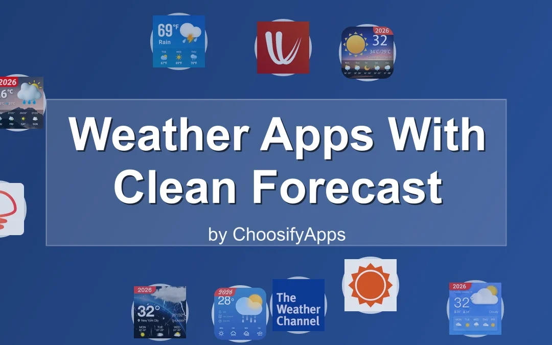
Weather apps with clean forecast layouts.
Tools that give you what you need—and then step aside.
Why Layout Matters More Than You Think
Weather information is simple at its core.
Temperature.
Rain or not.
Wind.
Time.
When the layout is clean, your mind stays clean too.
A good forecast layout feels like a well-organized room.
Everything has a place.
Nothing competes for attention.
You breathe easier without realizing why.
Clean design isn’t about beauty.
It’s about relief.
What “Clean” Actually Means in a Weather App
Clean doesn’t mean empty.
It means intentional.
- Information appears when you expect it
- Text is legible without effort
- Colors guide rather than distract
- Forecasts feel glanceable, not demanding
Most importantly, clean layouts respect your time.
They don’t make you work for clarity.
Weather Apps That Keep Their Voices Low
Below are apps that understand restraint.
They don’t rush you.
They don’t overwhelm.
They simply tell the truth about the sky.
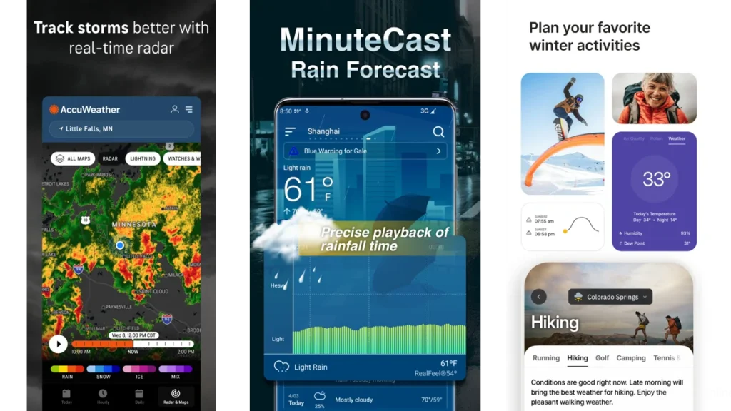
Foreca Weather & Radar — Information That Stays in Its Lane
Foreca feels composed.
Open it and the forecast is already there.
No searching.
No flashing distractions.
The layout favors vertical flow.
Today at the top.
Tomorrow below.
The week waiting patiently.
Radar maps exist, but they don’t dominate.
They wait until you ask.
Foreca is for people who want accuracy without intensity.
It feels like a quiet briefing, not a broadcast.
Clear Skies — A Week Laid Out Gently
Clear Skies understands spacing.
Forecasts are spread out.
Readable.
Unrushed.
You can scan a week ahead without your eyes tightening.
Each day stands on its own.
It’s the kind of app you check while coffee cools.
Nothing urgent.
Nothing sharp.
Just weather, arranged kindly.
SimpleWeather — The Courage to Do Less
SimpleWeather is honest.
There are no layers to peel back.
No surprises.
Temperature.
Conditions.
Forecast.
That’s it.
And somehow, that’s enough.
The layout feels like a handwritten note taped to the fridge.
Clear.
Useful.
Gone when you close it.
If you’re tired of apps trying to impress you, this one won’t.
Weawow — When the Forecast Feels Like a Window
Weawow does something subtle.
It pairs weather data with real photographs—
clouds when it’s cloudy,
light when the sun is out.
The layout stays readable.
The imagery stays calm.
It feels less like checking data
and more like looking outside before deciding what to wear.
Weawow is for visual thinkers who still want quiet.
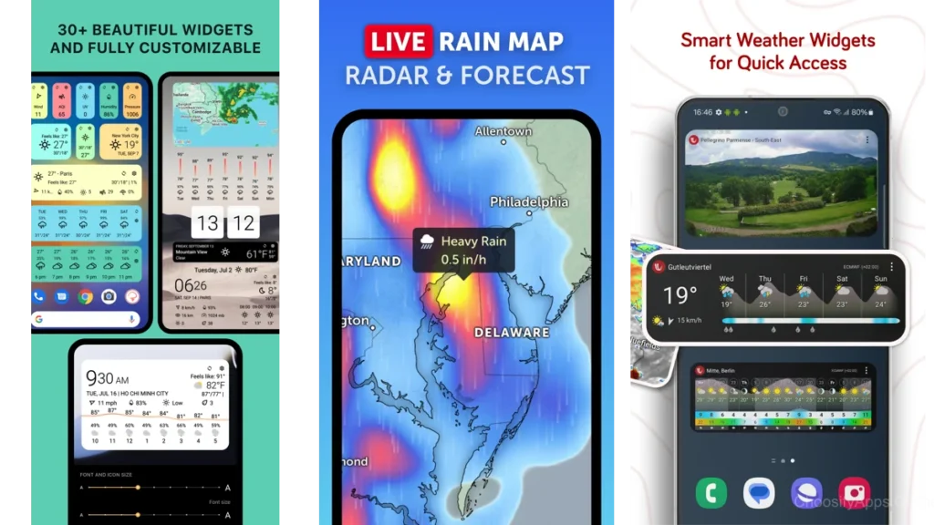
Overdrop — Clean Widgets, Calm Glances
Overdrop shines on the home screen.
Its widgets are restrained.
Elegant.
Easy to glance at without unlocking anything.
Inside the app, the layout remains structured and modern.
Nothing spills over.
Nothing crowds.
It’s a good choice if you want weather awareness without opening an app at all.
Overmorrow — Modern Design Without Noise
Overmorrow feels current without feeling loud.
Built around modern Android design language,
it uses color sparingly and space generously.
Forecasts scroll smoothly.
Information unfolds in layers that make sense.
It feels considered.
Like someone spent time removing things.
A Simple Comparison
| App | How It Feels | Best For |
|---|---|---|
| Foreca | Calm and factual | Reliable daily planning |
| Clear Skies | Spacious and gentle | Weekly overviews |
| SimpleWeather | Bare and honest | Minimalists |
| Weawow | Visual and serene | Seeing the weather |
| Overdrop | Quietly stylish | Widgets and glances |
| Overmorrow | Modern and balanced | Clean Android design |
Why Some Weather Apps Feel Loud
It’s not the data.
It’s the presentation.
Too many colors compete.
Too many numbers shout.
Too many alerts assume urgency.
Weather doesn’t need drama.
Rain will still fall without a push notification.
Clean apps trust you to look when you’re ready.
Which One Should You Choose
If you want the least mental friction, choose SimpleWeather.
If you like seeing the week at a glance, Clear Skies works well.
If visuals help you feel oriented, Weawow feels natural.
If your home screen matters, Overdrop stays out of the way.
If you like modern polish without clutter, Overmorrow fits.
There’s no wrong choice.
Only what feels calm to you.
Using Weather Apps Without Burnout
Check the weather once.
Twice at most.
Let it inform your jacket, not your mood.
Turn off unnecessary alerts.
Remove widgets you don’t glance at.
The forecast should support your day,
not narrate it.
Weather, Minimalism, and Mental Space
Minimalism isn’t about empty screens.
It’s about fewer interruptions.
When a tool does its job quietly,
your mind stays available for other things.
Conversation.
Focus.
Rest.
Calm is not accidental.
It’s designed.
Conclusion
The weather will do what it does.
A good app doesn’t dramatize that truth.
It simply holds the information for you, briefly,
then lets you return to your day.
Clean forecast layouts don’t just show the sky.
They create space beneath it.
And sometimes, that space is the most useful thing an app can offer.
FAQ
Do clean weather apps sacrifice accuracy?
No. Clarity and accuracy are separate choices. Many clean apps are highly reliable.
Are minimalist weather apps good for severe weather alerts?
Yes, as long as alerts are enabled intentionally and not by default.
Is a simple layout better for daily use?
For most people, yes. Less scanning means less fatigue.
Do these apps work well on older phones?
Often better. Clean layouts tend to be lighter and faster.
Can a weather app really reduce stress?
Indirectly, yes. Fewer visual demands create quieter moments.