It usually starts the same way.
A long day.
A brief pause.
The phone in your hand.
You are not looking for delight.
You are looking for ease.
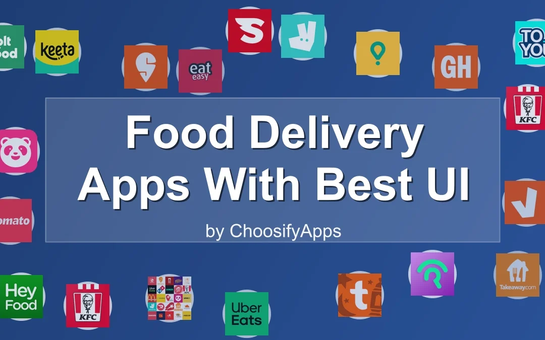
Food delivery apps have become part of the furniture of modern life.
Always there.
Always ready.
And yet, some of them ask too much.
Too many banners.
Too many choices at once.
Too much noise.
This piece is about the few that do not.
The ones that understand that good interface design is not about impressing you.
It is about letting you rest.
A Small Moment Before Ordering
When screens feel loud
Digital fatigue is rarely dramatic.
It arrives quietly.
A sigh when the app opens.
A hesitation before tapping.
A sense that even choosing dinner feels heavier than it should.
In those moments, interface design becomes emotional design.
Not because it entertains you.
But because it respects your energy.
Why interface design quietly matters
A good UI does not announce itself.
It feels like walking into a familiar room.
You know where things are.
Nothing rushes you.
In food delivery apps, this matters more than almost anywhere else.
You arrive hungry.
Tired.
Often distracted.
The best apps understand this without saying so.
What “Good UI” Really Feels Like
Less thinking, more breathing
Strong UI reduces decision-making.
It does not overwhelm you with endless tiles.
It groups.
It guides.
You move forward without feeling pushed.
Familiar paths, gently marked
The best interfaces repeat themselves intentionally.
The same buttons.
The same gestures.
The same rhythm.
Your hands learn before your mind does.
When design steps out of the way
There is a moment—rare and valuable—when you forget the app entirely.
You are simply choosing food.
That is the goal.
Global Apps That Feel Calm in the Hand
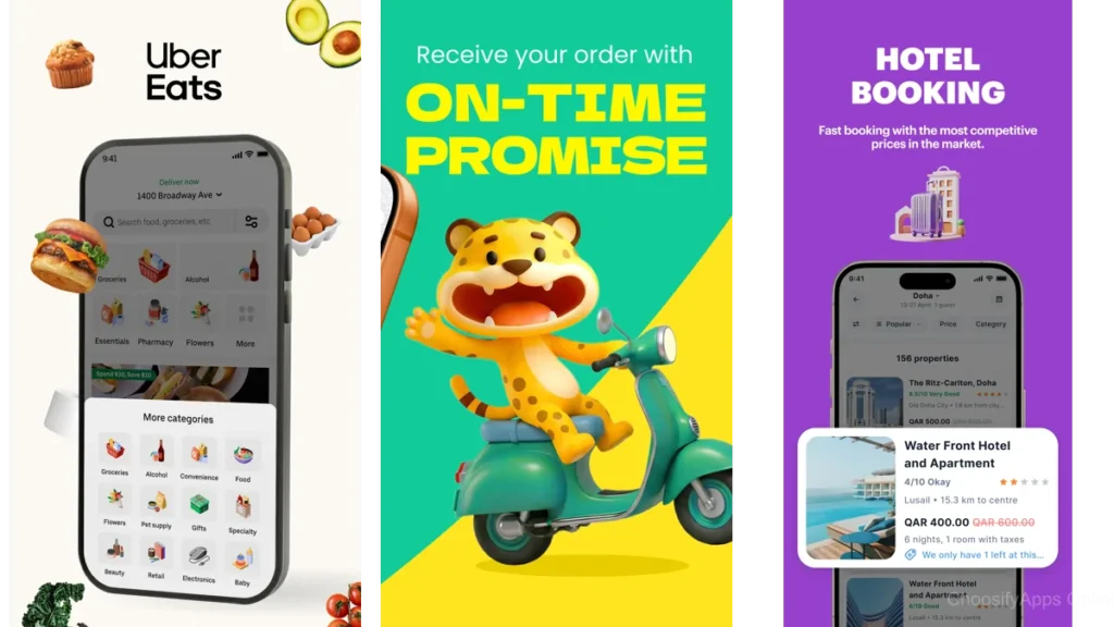
Uber Eats: A map that reassures
Uber Eats feels like a quiet city map.
You always know where you are.
Where the restaurant is.
Where your food is heading.
The interface favors clarity over personality.
Tracking is gentle, almost meditative.
No unnecessary interruptions.
No frantic prompts.
It trusts that you know why you opened the app.
Deliveroo: Space between decisions
Deliveroo’s strength lies in restraint.
Menus breathe.
Images are present but not aggressive.
Transitions feel slow enough to be human.
It is an app that understands pacing.
You are allowed to scroll without being chased.
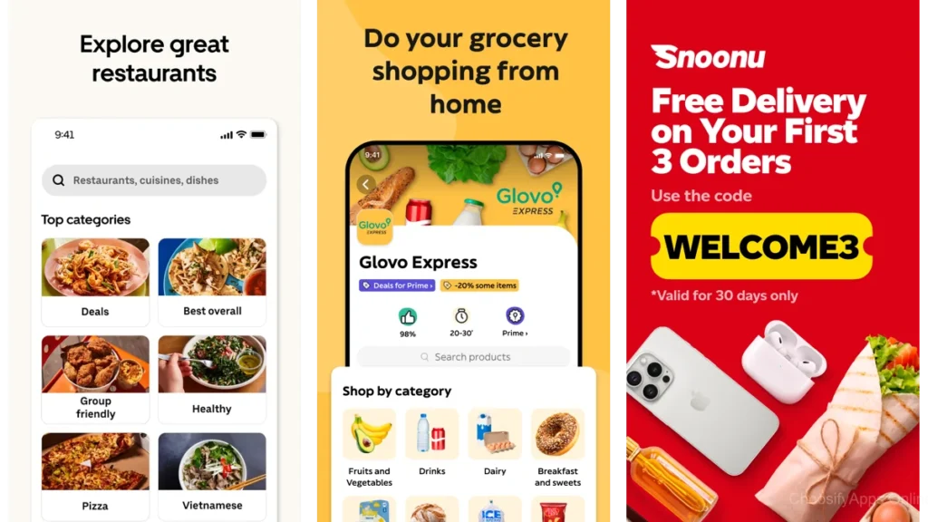
Zomato: Discovery without pressure
Zomato leans into exploration, but carefully.
Filters are clear.
Categories make sense.
Reviews feel contextual rather than overwhelming.
It is discovery designed for curiosity, not urgency.
Local Apps That Understand the Region
Snoonu: Built with Doha in mind
Snoonu feels local in the best way.
Not just in restaurant selection, but in flow.
The app anticipates common needs.
Addresses are handled thoughtfully.
Checkout feels reassuringly simple.
There is confidence here.
The kind that comes from knowing your audience well.
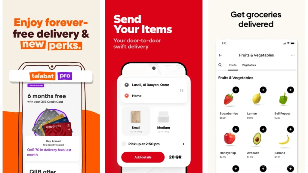
talabat: Carrying weight gracefully
talabat has a lot to manage.
Food.
Groceries.
Pharmacies.
And yet, it largely holds this complexity together.
While it can feel busy at times, its structure remains familiar.
Regular users move through it almost on autopilot.
That familiarity is its quiet strength.
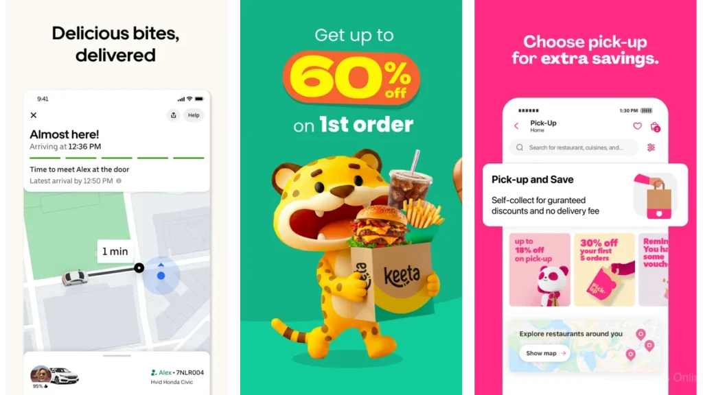
Keeta: Quiet efficiency
Keeta does not try to charm you.
It focuses on speed and clarity.
The interface is clean.
The steps are minimal.
You are rarely unsure of what comes next.
It is an app that finishes its work quickly and steps aside.
How These Apps Differ, Softly
| App | How It Feels | Best For |
|---|---|---|
| Uber Eats | Calm and predictable | People who value clarity |
| Snoonu | Local and intuitive | Doha-based everyday use |
| Deliveroo | Spacious and gentle | Slow, mindful browsing |
No app here is perfect.
But each understands that calm is not accidental.
It is designed.
Which One Should You Choose?
This depends less on features and more on temperament.
If you like familiarity and visual stability, Uber Eats will feel grounding.
If you want something that understands local rhythms, Snoonu often feels most natural.
If clutter bothers you deeply, Keeta or Deliveroo may offer relief.
The right choice is the one that asks the least of you.
Using Food Apps Without Feeling Drained
You do not need a new system.
Just a few small habits.
Order from the same places more often.
Let your muscle memory work.
Turn off unnecessary notifications.
Silence is generous.
And remember: the app is a tool, not a destination.
It should disappear once dinner arrives.
Conclusion: When the App Finally Goes Silent
The best food delivery apps do not linger.
They open.
They help.
They leave.
What remains is the meal.
The pause.
The space you needed all along.
In a world full of digital noise, that quiet matters.
FAQ
Which food delivery app has the simplest interface overall?
Many find Uber Eats and Keeta the least mentally demanding due to their predictable layouts.
Is a minimal UI always better?
Not always. Familiarity can matter more than minimalism, especially for frequent users.
Do local apps really design differently?
Often, yes. Local context shapes how addresses, timing, and flow are handled.
Can UI design reduce decision fatigue?
Absolutely. Clear grouping and gentle pacing make choices feel lighter.
Should I use more than one app?
It can help. Different moods call for different experiences.